Portfolio
House Sadness the Podcast
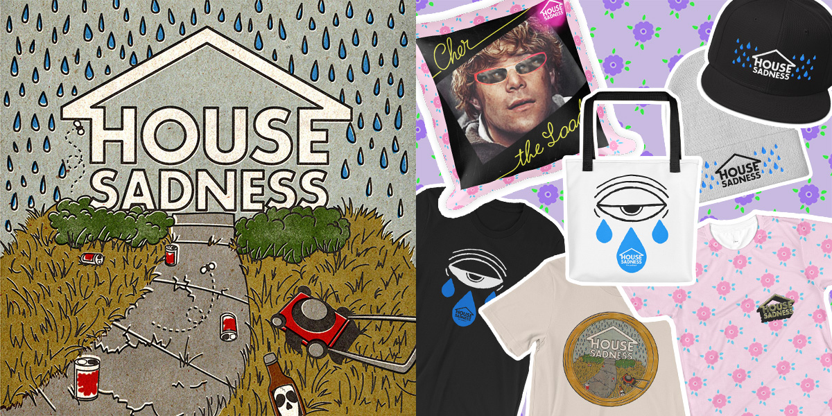
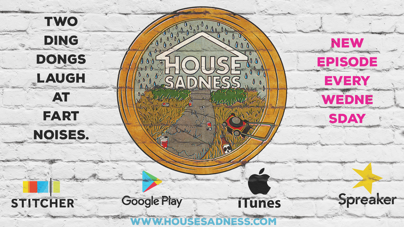
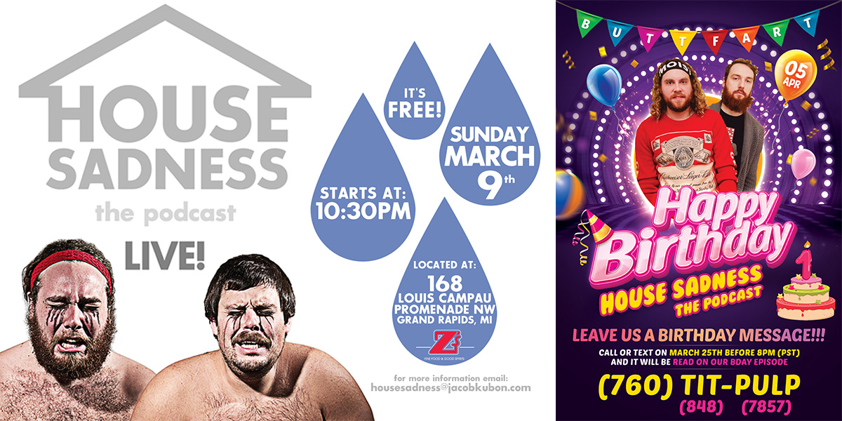
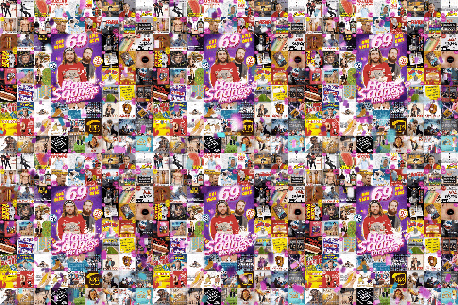
House Sadness the Podcast has been a long term gig for me, from their very creation, I have always been their go-to designer. There are many other examples of what I have made for them throughout the years.
In regards to the logo, they wanted something text-simple, eye-catching, and including the two host’s faces on it. Simply bringing the house in line and connected to the letters made a quick and simple logo, simple enough to add to any graphic and make sure the audience had instant recognition what it was from, and later simple enough to include in a more illustrative logo and garner the seem effect.
Project Details
- Branding
- Logo Design
- Identity
- Podcast
- Graphic Design
- Illustration
- Audio Editing
- Audio Recording
