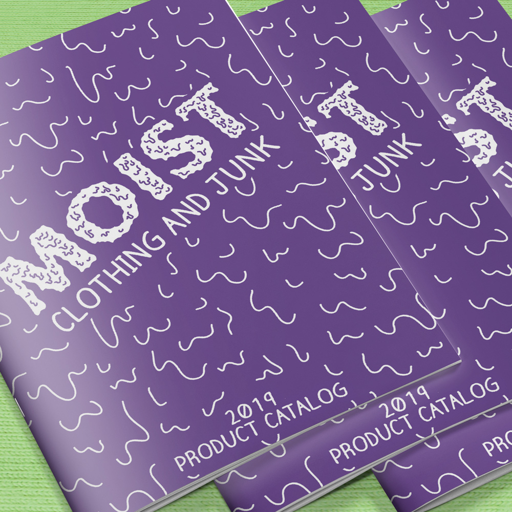
Portfolio

Prescription for Addiction
An automobile accident started Ken Start’s fifteen-year prescription drug addiction cycle. Taking handfuls of pills off and on during the day, he was often high, passed out, or throwing up in the toilet. He did whatever it took to buy or steal what he wanted and needed the most—drugs. He never thought about those he was hurting and continued to destroy the trust once shared with his loved ones. In rehabilitation clinics, he learned how to manipulate doctors into giving him more—and better—drugs. He was living in total denial of his addiction to prescription drugs—until the whisper of suicide got louder. A Prescription for Addiction is this author’s journey through a life-changing auto accident, multiple surgeries, addiction to drugs and alcohol, manipulation of medical professionals, chronic pain and the miracle of a hard fought recovery.
The design of this entire book is to resemble the look of a pill bottle with a very eye-catching orange background and white cap, but once you take a closer look at the details in the design is when it all starts to paint a very personal picture of one man’s struggle with addiction to prescription medication.
The title of the book and author name is worked in to the cover as if it were a prescription label made out to him. The pharmacy at the top is a generalized take on the location of where all of this began. “Take As Needed for Pain” was written on every bottle and refill he received during his “recovery” and beginning his addiction. “0 refills since 08/12/07” takes the place of what would normally list how many refills one has left, and instead tells the reader how long he has been off prescription pain-killers. A very small and subtle line, but an incredible accomplishment to share with the reader and especially if that reader is also someone who is struggling.
There is a smidge of red on the side of the cover which brings your eyes around the side of the book to the spine, which has a bright red warning label on it that holds the title of the book and the author’s name. As your eyes continue down the spine, you notice the label is not complete at the bottom, which brings you around to the back of the book.
The back of the book continues the prescription bottle look, every piece referencing something you would normally see on the bottle; the author’s photo is made to look like another label added on to the already packed bottle, along with another label informing the reader who wrote the forward, and then finally the description of the book, the story, the struggle that he went through printed on the same label that is printed on the cover, bringing everything back around to where it began.